


Gearing Up!
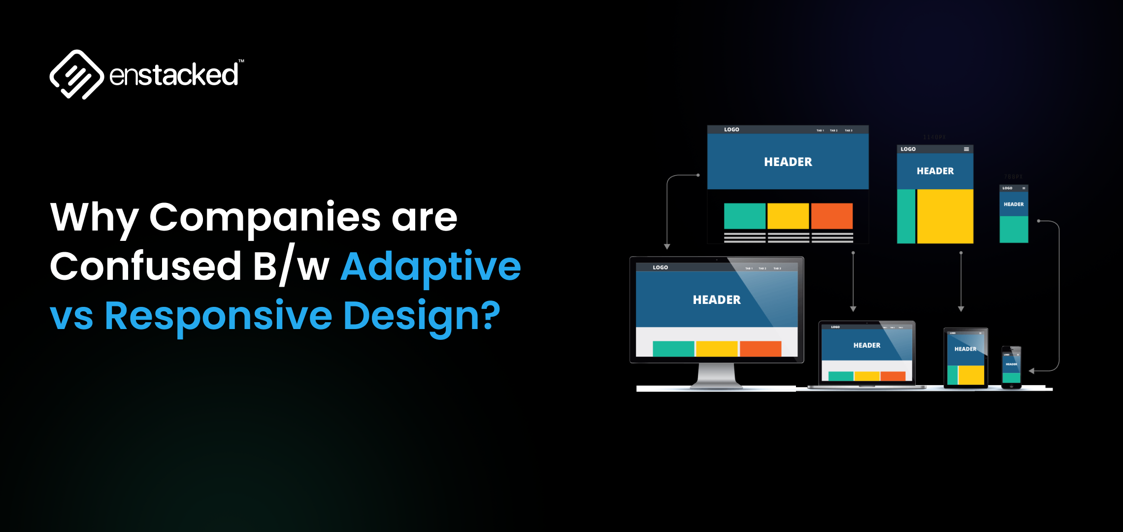
Think about the last time you visited a website. On your phone, it looked sharp and scrollable. Later, on your desktop, it stretched beautifully across the screen, clean, consistent, and smooth. That’s the power of modern web design.
But behind that seamless experience lies a big choice: adaptive vs responsive.
Both approaches aim to deliver user-friendly experiences across devices, but here’s where they diverge:
- Responsive design is like water. It flows to fit the shape of the screen, whether it’s a phone, tablet, or desktop. One flexible layout, infinite possibilities.
- Adaptive design is like a custom wardrobe. It builds specific layouts for specific screen sizes, swapping in the perfect fit whenever a new device loads the page.
As of 2025, over 65% of global internet traffic comes from mobile devices (Statista), and 90% of businesses have already shifted toward responsive design.
Yet, adaptive design is still the secret weapon for high-performance websites where precision and control matter, such as e-commerce giants or streaming platforms.
This blog will unpack responsive design vs adaptive design, explore adaptive vs responsive web design examples, and help you figure out which approach is best for your site.
What is Responsive Design?
Responsive design is a web design approach where a single website layout automatically adjusts to fit different screen sizes and devices, whether it’s a smartphone, tablet, laptop, or a widescreen desktop.
This is achieved through:
- Fluid grids – Layout elements sized in percentages instead of fixed pixels.
- Flexible images and media – Images scale within their containers without breaking the design.
- CSS media queries – Rules that adapt the design based on screen width, orientation, and resolution.
The main goal of responsive web design is to ensure a seamless, consistent experience for users, regardless of the device they use.
Example:
Think of Apple’s website. Whether you open it on a phone, tablet, or a wide-screen monitor, the content reorganizes fluidly without needing separate URLs or templates.
Pros of Responsive Web Design
1. Mobile-First Optimization
With over 65% of global web traffic coming from mobile devices, responsive design ensures your website looks great and functions smoothly on smartphones and tablets.
2. Cost-Effective
You only need to build and maintain one website rather than separate desktop and mobile versions, saving both development time and ongoing maintenance costs.
3. SEO Benefits
Google recommends responsive design for mobile-first indexing, meaning your site is more likely to perform well in search rankings without duplicate content issues.
4. Consistent User Experience
A unified layout ensures users have a consistent experience across all devices, boosting engagement and trust.
5. Future-Proof
Responsive layouts automatically adjust to new screen sizes and resolutions, making them adaptable to the next wave of devices.
Cons of Responsive Web Design
1. Performance Challenges
If not optimized, responsive designs can load unnecessary elements (like large images) on smaller screens, slowing down performance.
2. Complex Testing
Testing a single layout across hundreds of device sizes and browsers can be time-consuming.
3. Design Limitations
You have less control over device-specific customizations compared to adaptive design.
4. Initial Build Effort
Developing a high-quality responsive layout can take more time and skill compared to building fixed layouts.
5. Requires Ongoing Optimization
To keep performance and accessibility strong, responsive sites need continuous updates as devices evolve.
Best For:
- Blogs, portfolios, e-commerce stores, and informational websites.
- Businesses are looking for cost-effective, future-proof solutions.
Looking to implement responsive layouts that not only look great but also drive conversions?
You can hire a designer from our team to build mobile-first, performance-driven websites.
What is Adaptive Design?
Adaptive web design is an approach where a website uses multiple fixed layouts tailored for specific screen sizes or devices.
Instead of one flexible layout (like in responsive design), adaptive sites detect the user’s device or viewport width and serve a predefined layout that best fits, for example, one for mobile, one for tablet, and one for desktop.
This strategy is perfect for brands that need precision and speed on specific devices and want full control over what each user sees.
Example: Think of Amazon. The homepage isn’t the same for everyone; it dynamically changes based on your browsing history, preferences, and location.
Pros of Adaptive Web Design
1. Faster Performance
Since each layout is pre-optimized for its target device, pages can load faster, creating smoother user experiences, especially important for high-traffic platforms like Amazon or AccuWeather.
2. Precision in Design
Adaptive gives designers more control over layout and user interface for different devices, ensuring every element is pixel-perfect.
3. Optimized User Experience
Different devices may have different user behaviors. Adaptive design allows you to prioritize features for each device. For example, simpler navigation on mobile and richer content on desktop.
4. Better for Legacy Sites
If you have an older platform or CMS, adaptive design can integrate better without a complete rebuild.
5. Improved Conversion Rates
When speed and personalization matter, like in e-commerce or travel platforms, adaptive layouts can drive higher engagement and conversions.
Cons of Adaptive Web Design
1. Higher Development Costs
Multiple templates mean higher upfront costs and more time for design and development.
2. Complex Maintenance
You need to maintain and update several versions of the same site, which can be resource-intensive.
3. Limited Flexibility
Adaptive layouts are designed for fixed breakpoints, so new devices or screen sizes might not display perfectly until a new layout is created.
4. SEO Challenges
Without careful setup, multiple templates can create duplicate content issues, making SEO management more complex compared to responsive design.
5. Slower Scaling
If your business grows or needs frequent updates, managing multiple device-specific templates can slow down deployment.
Best For:
- E-commerce platforms.
- Membership or subscription sites.
- Any site that requires real-time personalization or frequent content updates.
As a trusted UI/UX design service provider, we help brands across industries design and execute both adaptive and responsive websites.
Responsive Design vs Adaptive Design: Key Differences to Know About!
| Aspect | Responsive Web Design | Adaptive Web Design |
|---|---|---|
| Definition | Responsive design uses fluid grids, flexible images, and CSS media queries to automatically adjust layouts across all devices. | Adaptive design delivers predefined, fixed layouts tailored to specific screen sizes detected by the browser or server. |
| Layout Behavior | Fluid and dynamic, reshaping in real time for any screen size. | Static and device-specific, switching between fixed breakpoints for mobile, tablet, and desktop. |
| Development Approach | Single codebase, easier to manage and update. | Multiple layouts need to be designed and maintained for various devices. |
| Performance | May load more slowly if not optimized, as one layout adjusts dynamically. | Often faster on specific devices since layouts are pre-optimized. |
| Flexibility | Highly flexible and future-proof, automatically adapting to new screen sizes. | Limited flexibility; requires updates when new devices or screen sizes emerge. |
| SEO Friendliness | Excellent for SEO, aligns with Google’s mobile-first indexing. | Also SEO-friendly, but it can be more complex to manage duplicate templates. |
| Maintenance | Simpler maintenance, since changes apply universally. | Complex maintenance, as each layout must be updated separately. |
| Cost & Time | Generally more cost-effective to build and maintain. | Higher initial cost due to multiple templates and more design effort. |
| Best Use Cases | Blogs, business websites, portfolios, and small to medium e-commerce stores. | High-performance sites like airline portals, news apps, or enterprise dashboards where control and optimization matter. |
| Examples | Apple, Airbnb, and Shopify stores with their clean and consistent experiences across devices. | Amazon apps, Netflix streaming dashboards, or custom-built enterprise platforms. |
According to recent UI/UX statistics in 2025, 45% of users expect content to display correctly across different devices. Ensuring responsive design is crucial for user satisfaction.
Adaptive vs Responsive Web Design Examples!
These sites are some of the best adaptive vs responsive web design examples. Here’s how they do it.
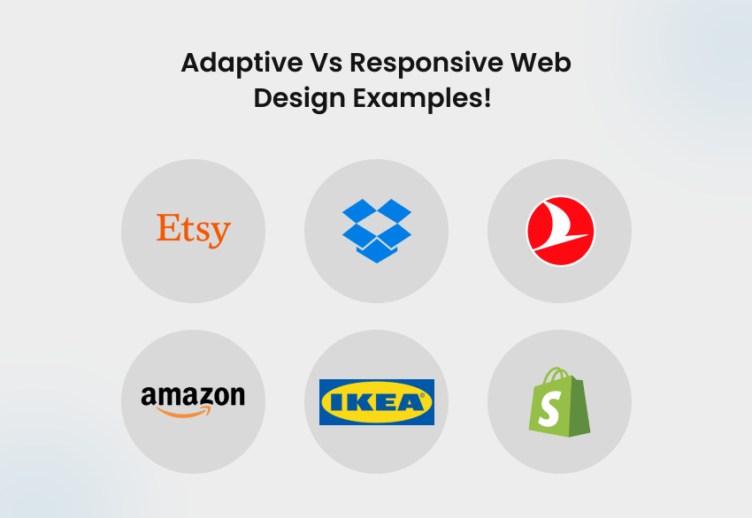
Etsy is a global e‑commerce marketplace focused on handmade, vintage, craft‑supply items, etc, connecting independent sellers with buyers worldwide. In 2024, Etsy generated around $2.81 billion in revenue, served 96+ million buyers, and partnered with ~8 million sellers.
It uses responsive design, ensuring fluid, consistent layouts across phones, tablets, and desktops with seamless shopping experiences across all devices.
Dropbox is a major player in cloud storage and collaboration, reporting $2.55 billion in revenue for 2024 and serving over 18 million paying users. It uses responsive design through fluid layouts that not only adjust across screens but also fine-tune visuals—like image orientation and font color—to ensure a cohesive experience on every device.
Turkey’s flagship airline offers passenger and cargo flights across the globe. They posted $22.7 billion in revenue and approximately $2.4 billion in profit in 2024. It employs an adaptive design approach, providing tailored layouts and features optimized for various devices, particularly for flight bookings or check-ins.
Amazon, the world’s largest e-commerce and cloud platform, earned $638 B in revenue and $59.2 B in net income in 2024. The site uses adaptive design via dynamic serving, delivering device-optimized layouts for a faster, seamless experience. It uses adaptive design via dynamic serving, delivering device-optimized layouts without altering the URL.
IKEA generated €45.1 B in retail sales in FY2024, with 4.6 B online visits and 214 M monthly visits in 2025. About 34% of online sales come from mobile. Its website uses adaptive design, streamlining mobile UX with simplified navigation and in-store shopping tools.
Shopify powers a vast global e‑commerce ecosystem with over 5 million merchants, processing $292.3 billion in transactions in 2024. Its site and the stores built on its platform are built using responsive design. This ensures that layouts, media, calls-to-action, and navigation adapt dynamically, delivering a seamless shopping experience.
Avoiding these Top 10 Mistakes in Web Design That Are Costing You Users can dramatically improve user trust, engagement, and conversion rates
Final Thoughts
Choosing between adaptive and responsive web design isn’t about picking a better option; it’s about finding the right fit for your business goals, audience, and growth strategy.
Responsive design is ideal for flexibility, scalability, and cost-effectiveness, while adaptive design excels when performance and device-specific precision are the top priorities.
So, if you are confused and want professionals to help you decide between adaptive design vs responsive design, and also help you with the execution, then we can help you out.
At Enstacked, a trusted IT service company, we understand that great design is more than just layouts; it’s about creating experiences that engage, convert, and build trust. Our team of skilled UI/UX designers specializes in crafting best-in-class, user-focused interfaces that your end audience will love.
To know more about us and how we can help you, book a free consultation with us today.
Frequently Asked Questions(FAQs)
The main advantage of adaptive web design vs responsive web design is speed and precision. Adaptive design serves predefined, optimized layouts for specific devices. This means pages load faster because the browser doesn’t need to process a flexible, fluid grid. It also allows designers to fine-tune user experiences for each device.
You might avoid responsive design in cases where:
- Performance optimization is critical, such as on high-traffic platforms or apps where every second matters.
- Device-specific customization is required, for example, travel portals, banking apps, or enterprise dashboards.
- Legacy infrastructure or content workflows make it easier to build multiple templates instead of maintaining a single responsive codebase.
It depends on your goals. Responsive design is ideal for most websites because it’s cost-effective, SEO-friendly, and future-proof. However, adaptive web design is better if you need device-specific performance and control, like Amazon or AccuWeather, where control and customization are critical.
Yes, but responsive design often wins for SEO. Google recommends responsive web design for its simplicity, single URL structure, and seamless mobile-first indexing. Adaptive sites can still rank well, but may require extra attention to duplicate content management and proper canonical tags.
Absolutely. Many modern brands now use a hybrid approach, blending the fluidity of responsive design with the precision of adaptive layouts. For example, a site might use responsive grids for general pages but adaptive templates for high-traffic checkout or dashboard sections.