


Introduction
React powers a major slice of the web. According to recent stats, React is used by about 4.8 % of all websites globally in 2025, translating to millions of live sites. Also, React downloads on npm hover around 25+ million per week, underlining how active its ecosystem remains.
With that scale and demand, UI/UX expectations are higher than ever. A clunky, heavy-handed carousel can spoil the illusion, adding load, hurting scroll performance, interfering with accessibility, or failing on mobile.
Before diving deep into libraries, it helps to understand how React differs from its backend counterpart, Node.js – read our guide on React.js vs Node.js to learn how both work together in modern full-stack apps.
That’s why choosing the best React carousel component library is no small decision.
- You want performance (SSR, lazy loading, minimal re-renders).
- You want accessibility (keyboard navigation, ARIA support, screen-reader friendliness).
- You want flexibility — deck it out with custom animations, responsive layouts, variable slide widths.
- And you want community & maintenance, a library that’s alive, tested, updated.
For developers focused on maximizing app speed and rendering efficiency, our detailed guide on React performance optimization techniques offers practical tips to enhance carousel responsiveness.
So, before you just install the first “react-something-carousel” NPM package, here’s what to look for, and then a curated list of the top contenders in 2025 worth evaluating.
What is the React Carousel Component Library?
A React Carousel Component Library is a pre-built toolkit that allows developers to easily create sliders or carousels in React applications without coding all the complex functionality from scratch.
It’s a plug-and-play solution that helps you add interactive slide transitions, autoplay, looping, navigation arrows, pagination dots, and responsive design, all while maintaining React’s component-based structure.

Instead of manually handling scroll logic, animation timing, or touch gestures, developers can simply import a carousel component, pass in data, and configure behavior with props.
These react carousel libraries save time, ensure consistent performance across browsers, and provide built-in accessibility features like keyboard navigation and ARIA support.
10 Top React Carousel Component Libraries!
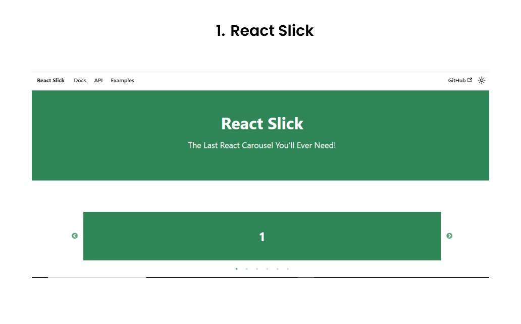
React Slick is essentially a React wrapper around the popular Slick Carousel (originally a jQuery plugin) with 1.2 million weekly downloads, adapted for modern React usage. The API is mature and stable, and it’s long been a go-to choice for many developers because of its rich feature set: autoplay, infinite loops, custom dots/arrows, variable slide widths, center mode, fade transitions, and more.
A downside: It still carries some architectural baggage, and it hasn’t always kept pace with modern React patterns. Some developers report encountering layout issues, especially with dynamic slide widths or responsive breakpoints.
Use it when you:
- Need a full-featured carousel quickly with many out-of-the-box options.
- Already have legacy dependence or familiarity in your team with Slick-like APIs.
- Want a well-tested, mature solution.
Be cautious if:
- You want a minimal, lightweight bundle (React Slick + its CSS can be heavier than more modern alternatives).
- You prefer hooks-based APIs or newer patterns (React Slick is more class-/ref-oriented).
- You need extremely fine-grained control of transitions or custom gesture handling beyond what React Slick offers.
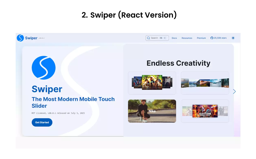
Swiper is a lightweight yet powerful React carousel library with over 4 million weekly downloads, known for its smooth performance and modular design. It has become a developer favorite for creating responsive, touch-enabled sliders.
This React carousel component library supports rich features such as virtual slides, autoplay, parallax transitions, lazy loading, dynamic breakpoints, and 3D cube effects, all while maintaining top-notch performance. A key advantage of Swiper is its modular architecture, so you can import only the modules you need, keeping your bundle size small.
Use it when you:
- Need a highly responsive, touch-optimized slider with strong mobile support.
- Want modular imports for performance-efficient builds.
- Require advanced animations, parallax effects, or virtualized slides.
Be cautious if:
- You just need a basic image carousel; Swiper’s setup might feel too heavy.
- Your build pipeline doesn’t handle modern ESM imports smoothly.
- You need deep custom control over transitions beyond Swiper’s module system.

Embla Carousel is a modern, minimalist React carousel component library for React that focuses on performance, accessibility, and full control through hooks.
With around 800K weekly downloads, it’s gaining popularity as a lightweight alternative. Unlike React Slick or Swiper, Embla doesn’t impose heavy styling or bundled dependencies; it gives you the bare functionality and lets you style or extend it however you like.
Use it when you:
- Want full creative control over carousel design and transitions.
- Need a lightweight, dependency-free React carousel component library optimized for performance.
- Work on projects where accessibility, keyboard navigation, and ARIA support matter.
Be cautious if:
- You want an out-of-the-box styled carousel (Embla is intentionally minimal).
- Your project needs autoplay, fancy 3D transitions, or advanced UI controls out of the box; these must be implemented manually.
- You prefer declarative JSX configurations over a hook-driven API.
4. React Multi Carousel
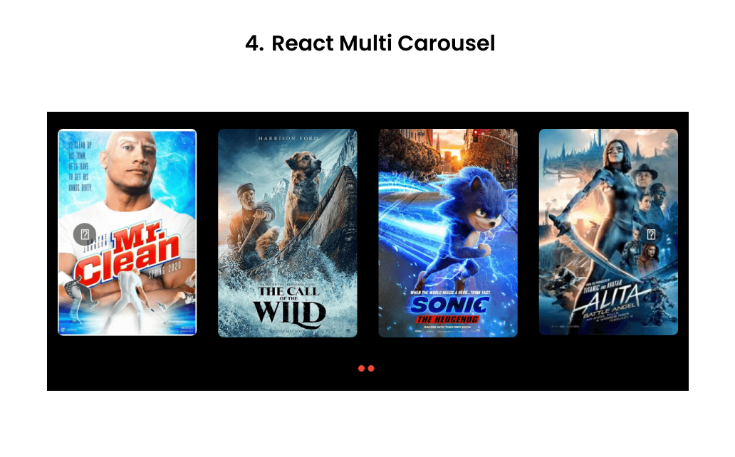
React Multi Carousel is a production-ready, fully customizable carousel with built-in SSR support. It’s designed especially for carousels that show multiple items at once, with responsive breakpoints, custom transitions, infinite looping, and variable widths.
Pros/strengths:
- SSR support is built in, making it safe to use with Next.js or other frameworks.
- Good flexibility in configuring how many items to show at different breakpoints.
- Rich configuration for arrows, dots, custom renderers, and responsive behavior.
Use it when you:
- Want a carousel that shows several cards/slides at once (not just one-per-view).
- Need SSR compatibility.
- Require responsive breakpoints and flexible layout control.
Be cautious if:
- Your requirement is just a single-image slider, and you want minimal overhead.
- You need super fine-grained control beyond what its API allows.
Also Read: Difference Between Next.js and React.js
React Responsive Carousel is another solid option that prioritizes responsiveness, simplicity, and accessibility. It supports touch/swipe gestures, keyboard navigation, dynamic height adaptation, and it’s fairly light in terms of dependencies.
Pros/strengths:
- Good out-of-the-box support for responsiveness and adaptive layout.
- Lower learning curve; often easier to integrate into projects without heavy configuration.
- Supports keyboard navigation and swiping, which helps with accessibility.
Use it when you:
- You need a responsive, accessible slider that “just works” in many cases.
- You don’t need fancy 3D effects or complex slide transitions.
- You prefer readability, maintainability, and simplicity over maximal features.
Be cautious if:
- You need animations beyond fade/slide, or want parallax/virtualization features.
- You have a large, performance-critical carousel above the fold (you might prefer something more optimized).
Pure React Carousel is a headless, unopinionated React carousel library built to give developers complete creative freedom. Instead of shipping with predefined styles or restrictive layouts, it provides a suite of modular components and hooks that you can assemble to create your own carousel from the ground up.
Strengths
- Accessibility-first architecture: Designed with ARIA attributes, keyboard navigation, and screen reader support, making it compliant with accessibility standards out of the box.
- Completely headless and modular: It doesn’t impose any design or layout, you get granular control through various different components.
- Lightweight and dependency-free: Since it ships without styling or animation frameworks, it keeps the bundle size lean and avoids performance overhead.
- Stable, predictable behavior: The declarative component API ensures consistent rendering and smooth control across devices, perfect for enterprise-grade UI libraries.
Use it when you:
- Want complete control over how your carousel looks and behaves.
- Need strong accessibility and semantic structure.
- Are building a design system or component library where UI consistency matters.
Be cautious if:
- You prefer pre-styled carousels with minimal setup.
- You don’t want to handle layout, transitions, and CSS manually.
- Your project timeline doesn’t allow for additional styling work.
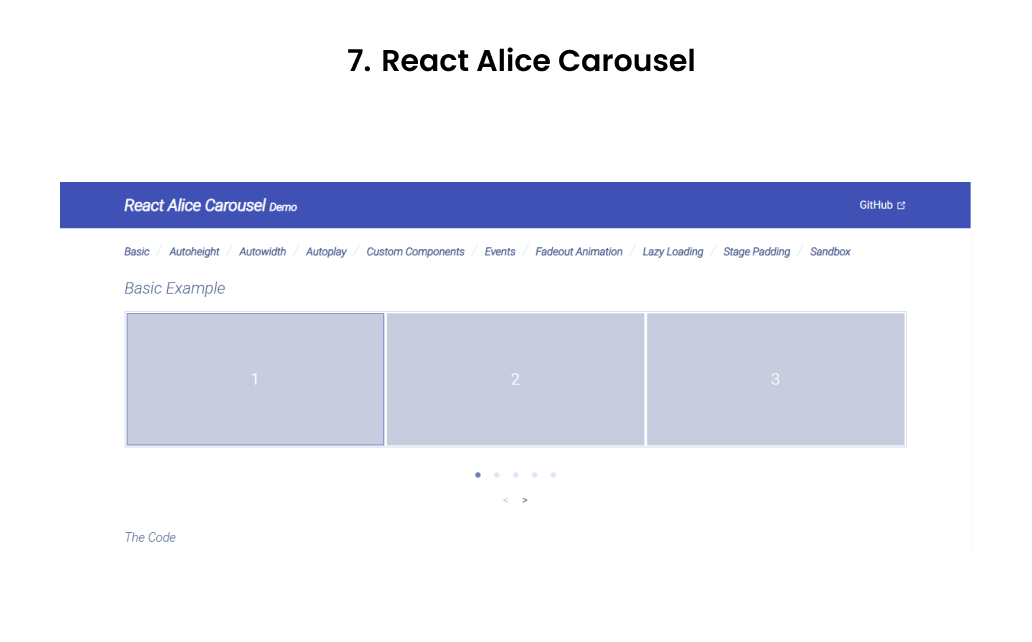
React Alice Carousel is a feature-rich, developer-friendly React slider known for its out-of-the-box functionality and smooth animations. It’s built for modern React apps that need responsive, customizable sliders without a steep setup curve. With over 600K weekly downloads on npm, it’s a popular choice for e-commerce and content-heavy UIs.
Strengths / Pros
- Rich in features: supports auto-height, auto-width, infinite looping, lazy loading, custom animations, responsive layouts, stage padding, etc.
- Good for mixed content: it handles custom slide elements, not just images.
- Fairly easy to set up, with built-in props for many common behaviors (autoplay, responsiveness, etc.)
Use it when you:
- You need a powerful carousel out of the box, with many common behaviors already baked in.
- You want to support mixed content (images + cards + text) without too much wiring.
- You appreciate a balance between flexibility and convention.
Be cautious if you:
- You need extremely custom transitions or deeply custom gesture logic.
- You prefer minimal dependencies and a lean bundle size.
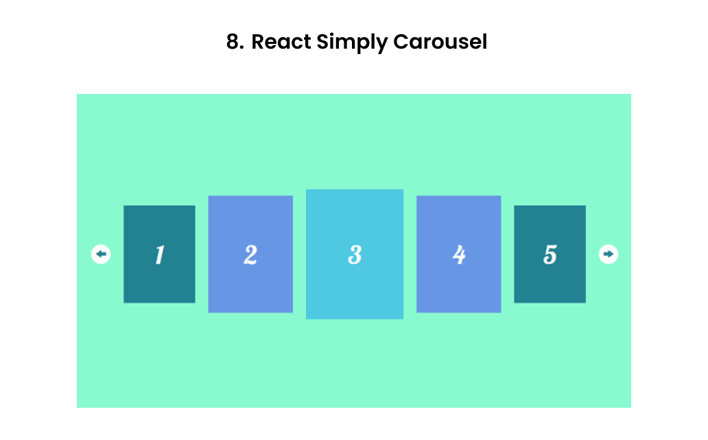
React Simply Carousel lives up to its name, a lightweight, minimal, and SSR-friendly React carousel component library focused on simplicity and reliability. It’s ideal for developers who want a basic, functional slider without pulling in unnecessary dependencies or animation-heavy logic.
Strengths/Pros
- Lightweight and focused, with fewer dependencies and features to manage.
- Controlled component / fully customizable behavior — good for integrating with your own state logic.
- SSR/isomorphic support works in server-side rendering environments without much fuss.
Use it when you:
- Want a simpler, more predictable carousel with good SSR support.
- Prefer more control and are comfortable wiring in behaviors yourself.
Be cautious if you:
- If you need heavy animations, fancy UI effects out of the box.
- You want a “plug-and-play” carousel with all bells and whistles with minimal setup.
Developers occasionally face issues like minified React errors during integration. Check our troubleshooting guide for Minified React Error 185 to resolve such problems efficiently.
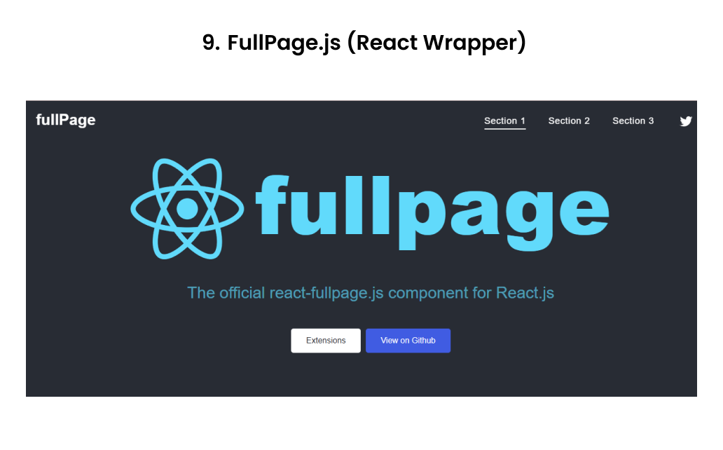
FullPage.js isn’t a typical image slider; it’s a full-screen scrolling and React carousel component library designed for building immersive, section-based experiences. With its official React wrapper, it lets you create slide-by-section navigation, vertical and horizontal carousels, and parallax-style transitions that feel like storytelling journeys rather than static sliders.
FullPage.js continues to see consistent adoption with over 150K developers using it globally and tens of thousands of live sites built on it.
Strengths:
- Combines vertical and horizontal scrolling for a unique user experience.
- Highly customizable with callbacks and React hooks integration.
- Offers responsive design, lazy loading, and plugin extensions like parallax or fading transitions.
- Great for immersive storytelling websites or product walk-throughs.
Use it when you:
- Want full-screen, scroll-snapping sections instead of a simple card carousel.
- Need a storytelling layout with both vertical and horizontal transitions.
- Are building portfolio, SaaS, or creative showcase websites where motion and flow matter.
Be cautious if:
- You only need a standard content slider; this React carousel component library can feel overkill.
- You want free-scroll behavior (FullPage.js intentionally “locks” scroll).
- You need ultra-light bundle sizes for performance-critical apps.
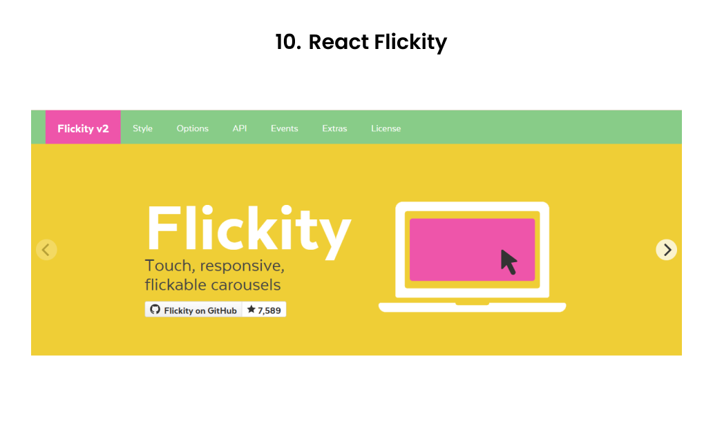
React Flickity is the official React wrapper around Flickity, a popular JavaScript carousel component library. It has been known for years for its buttery-smooth physics, drag support, and modern motion design, and the React integration brings those features to JSX in a clean, declarative way.
With over 500K weekly downloads, React Flickity remains a favorite among designers and developers who value visual fluidity and subtle animation quality.
Strengths:
- Extremely polished motion engine with silky drag gestures and transitions.
- Proven reliability with a large, active community and years of stability.
- Rich feature set that supports free scroll, autoplay, fade mode, and adaptive heights.
- Excellent choice for image galleries, portfolios, and visual product sliders.
Use it when you:
- Want smooth physics-based transitions and modern, polished animation.
- Need a battle-tested, stable carousel for image galleries or product sliders.
- Prefer a simple declarative JSX API with minimal setup.
Be cautious if:
- You need a fully “React-native” solution built around hooks and state.
- You’re building complex SSR (Next.js) apps — integration may require tweaks.
- You want full control over event handlers and DOM lifecycles.
Final Thoughts
The best React carousel component library is the one that aligns with your project’s goals, whether it’s speed, flexibility, or design control. From Swiper’s modern performance to Embla’s minimalism and React Multi Carousel’s versatility, each react carousel component library brings unique strengths to your React toolkit.
As an IT service company, we help brands turn these tools into seamless digital experiences. As a leading React development company, our team of expert developers builds interactive, high-performing web apps using the latest React carousel libraries and modern UI patterns.
If you’re ready to elevate your frontend experience, hire ReactJS developers from Enstacked, and let’s build something exceptional together.
Frequently Asked Questions(FAQs)
Some of the best React carousel component libraries in 2025 include Swiper, React Slick, Embla Carousel, Keen Slider, and React Multi Carousel. These React carousel libraries offer features like autoplay, responsive layouts, lazy loading, and accessibility support, making them reliable React Carousel Components for modern web apps.
For most projects, Swiper is the preferred React carousel component library due to its high performance, modular architecture, and mobile touch optimization. It’s perfect for eCommerce sliders, testimonials, and hero banners, offering smooth transitions and a clean React integration.
The best React carousel component library for multi-item slides is React Multi Carousel, designed specifically for showing multiple slides per view with full responsive breakpoints and SSR support. It’s ideal for product showcases and content grids where multiple items appear simultaneously.
To choose the best React carousel component library, consider your project’s needs:
- For performance and mobile UX → use Swiper or Keen Slider.
- For custom design control → go with Embla Carousel or Pure React Carousel.
- For multi-item layouts → choose React Multi Carousel.
Always evaluate bundle size, accessibility, and flexibility before selecting a React carousel component library for your project.